Voclr.it is a platform built for discovering, previewing, and downloading studio quality acapellas. As the library and feature set expanded, the interface naturally grew over time too, and with that came a mix of visual styles that were not always consistent from page to page. This update is a full design system refresh aimed at modernizing Voclr.it, improving visual consistency, and supporting faster performance across the experience.
Why we refreshed the design
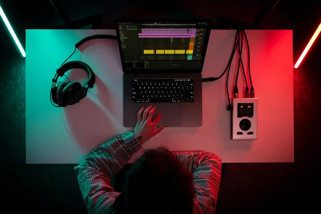
When people use Voclr.it, they are usually moving quickly, searching, filtering, previewing, and comparing vocals. The interface needs to feel clean, predictable, and easy to scan. The previous look included a combination of different neutral tones and occasional gradient styling, which made the platform feel less unified than it should. The goal of this overhaul was to create a single, cohesive design language that feels modern, professional, and consistent everywhere.
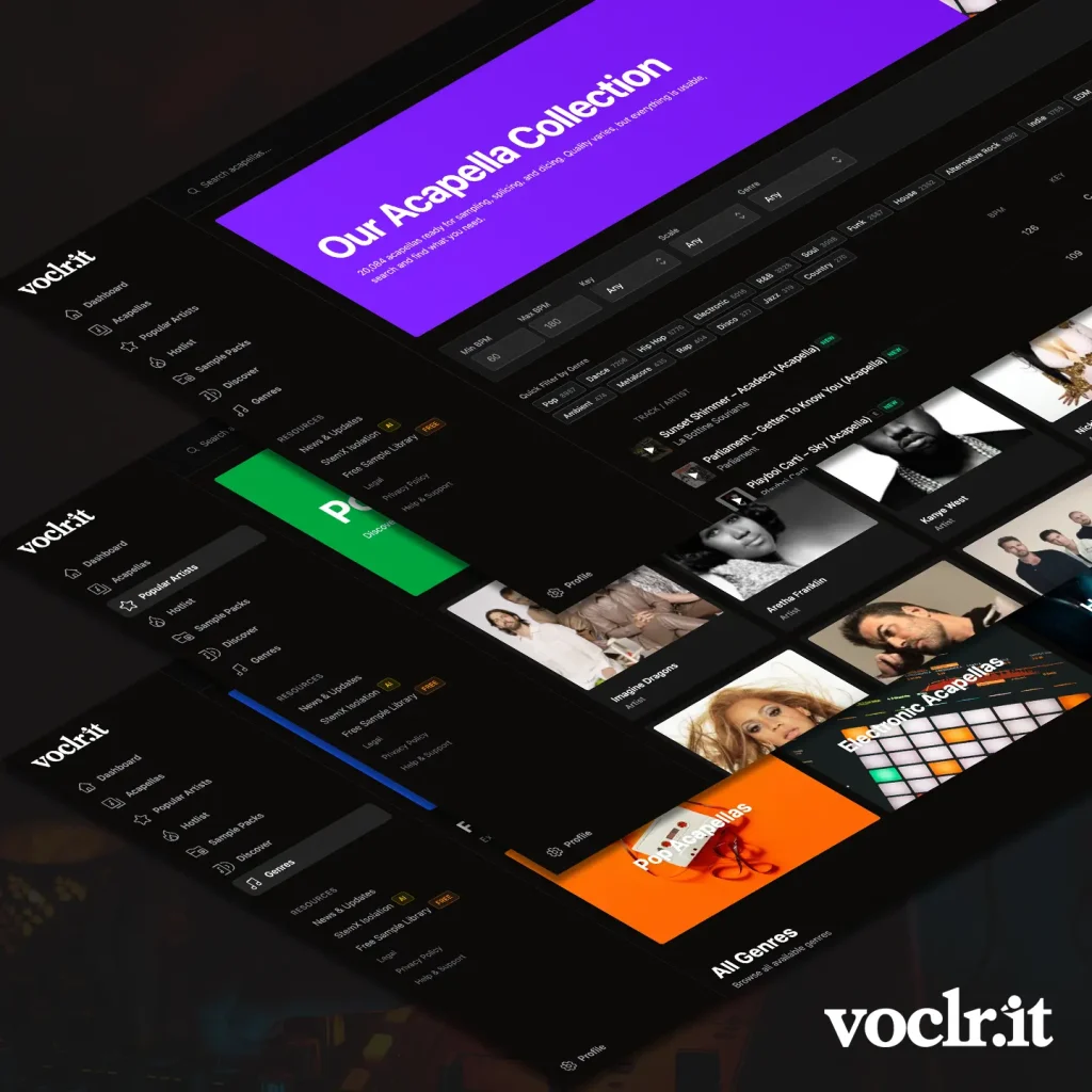
A simpler, more cohesive colour system
The biggest visual change is the move to a unified dark theme built around deep neutral backgrounds, soft neutral borders, and clearer text contrast. On top of that, Voclr.it now uses a consistent violet accent colour for key interactive elements. This creates a stronger brand identity and makes it easier to recognise what is clickable, what is primary, and what matters most on each page.
Gradients have been removed in favor of solid colours. This keeps the design cleaner and more modern, and it also helps pages render more smoothly.
Cleaner components and a more consistent feel
Alongside the colour refresh, UI components have been standardized so the platform feels more uniform. Key areas like authentication pages, navigation, and membership related screens have been brought in line with the same visual rules. The result is a more polished experience where layouts, buttons, alerts, and interactive elements behave and look consistent across the site.
Performance improvements, waveforms and audio feel instant
This design overhaul also aligns with performance work happening across Voclr.it. Waveforms and audio now load faster and more reliably, making browsing and previewing feel far more responsive. The overall experience is quicker, smoother, and better suited to fast creative workflows.
Fixes that improve everyday browsing
As part of the update, filtering and browsing interactions have been refined to feel more reliable and predictable. Small issues that could interrupt discovery have been addressed so searching by genre and navigating results is smoother.
What this means going forward
With a clearer design system in place, Voclr.it now has a stronger foundation for future updates. It is easier to keep the platform consistent as new features ship, and it keeps the focus on what matters most, helping creators find the right vocal quickly, preview it instantly, and stay in flow.