I’ve just rolled out a set of UI and UX improvements on Voclr.it, and the focus was simple: make the site feel slimmer, faster, and easier to browse when you’re hunting for the right vocal.
I wanted the experience to feel more like you’re exploring and less like you’re digging through pages and menus.
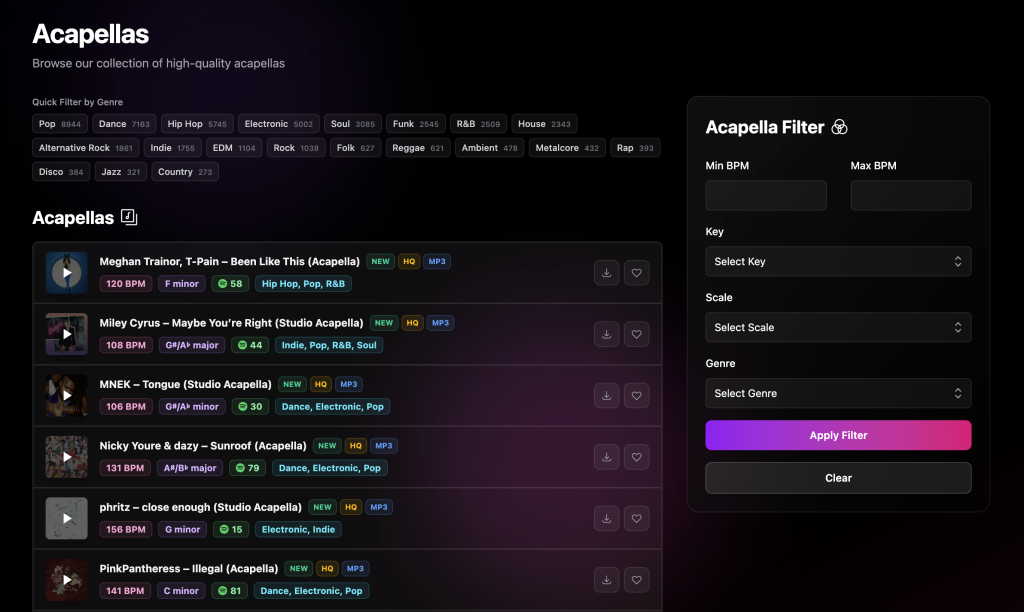
A cleaner, more streamlined layout
The first thing you’ll notice is the layout. It’s more minimal, with less clutter, and it keeps your attention on the vocals instead of the interface.
Everything is easier to scan, it feels lighter, and it’s quicker to move around the site without getting slowed down.
Filtering is now faster and simpler
Filtering was a big part of this update. I’ve made it easier to narrow things down quickly so you can get from browsing to finding something usable in way fewer steps.
The idea is that you can explore more options in less time and stay in the flow while you’re working.
New instant genre filters with 20 top genres
The main feature I’m really excited about is instant genre filtering. I added 20 of the top genres as one click filters so you can jump straight into the style you want without messing around.
If you already know what you’re making, you can now get into the right vibe immediately. And if you’re just exploring, it makes it really easy to switch styles and discover vocals you might not have found otherwise.
Why I made these changes
Voclr.it is all about helping producers find the right acapellas fast. As the library grows, the browsing experience has to keep up. These updates are my way of making sure the site stays quick, clear, and fun to use.
Try it out
If you’ve used Voclr.it before, I think you’ll feel the difference straight away. Check out the new layout, hit the instant genre filters, and see how quickly you can get to the vocals that fit your track.